


David G. Simmons
April 16, 2020
This stuff is FAST!
I’ve done a lot of projects using InfluxDB over the past few years (well, I did work there after all) so maybe I developed a bit of a bias, or a blind-spot. If you follow me on twitter, then you may have seen me post some quick videos of a project I was working on for visualizing COVID-19 data on a map.
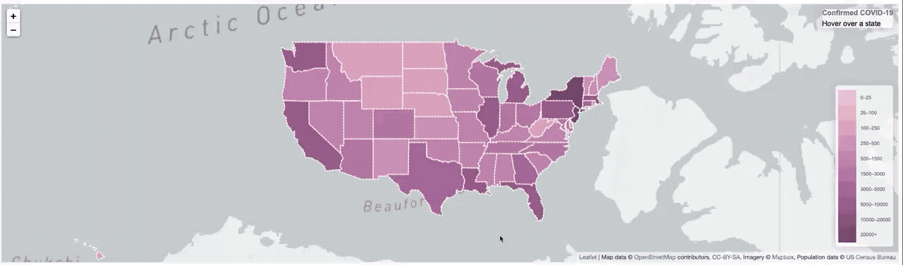 It worked, but it was pretty slow. So much so that I had to put a ’loading’ overlay on it so you knew it was still actually doing something while it was querying the data from the database. I actually sort of thought it was pretty fast, until I started trying to load data from all of Asia, or all of Europe, where that was a lot of data and the query got complicated.
But, since I no longer work at InfluxData I decided to branch out a bit and try some other solutions. I mean, what’s the harm, right? I found this little startup doing a SQL-based Time Series database called QuestDB so I thought I’d give it a whirl. Really small (basically embeddable) and all written in Java (hey, I used to do Java! Started in 1995 in fact!) so what the hell.
Frankly, I’m stunned. The performance of this thing is mind-blowing. Just look at this:
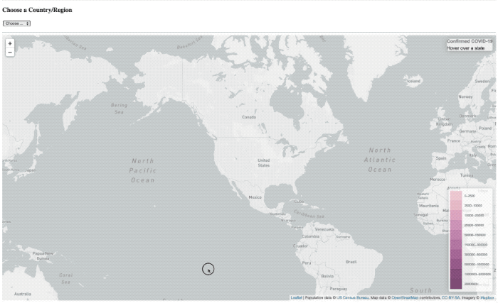
The ’loading’ overlay is still there, it just basically doesn’t have the time to show up anymore.
In addition, the query language is … SQL. Hell, even I know SQL! I have to dust it off a bit, since it’s been years since I wrote any, but it’s like riding a bike, mostly.
You’re probably going to ask me, since I made such a big deal out of it before, “yeah, but how long did it take to set it up?” I’ll tell you: 30 seconds. I downloaded it and ran the questdb.sh start script and … it was set up. Of course, it had no data, so I had to load it all in. Ok, so how long did that take? And how hard was it? Well, ummm …
I altered my Go program that had previously transmogrified all the John’s Hopkins COVID-19 data from their .csv files to Influx Line Protocol files, so I spent a few minutes altering that so that it output everything into a single, unified, normalized .csv file (JHU changes the format of their csv files quite often, so I have to keep adapting). Once I had that, I just drag-and-dropped it into the QuestDB interface:
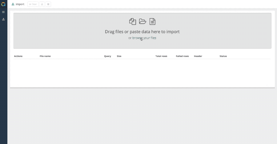
In case you missed that, it was 77,000 rows imported in 0.2 seconds.

Oh, and then I clicked the ‘view’ icon and … 77,000 rows read in 0.016 seconds. And that number is not a typo. zero-point-zero-one-six seconds. Granted, the rows aren’t that wide, but still, that’s unholy fast.
So now I have a new toy to play with, and I’ll see what else I can do with it that’s fun, and probably more IoT related.
Stay tuned.
 English
 Deutsche
 Dutch
Dutch Español
 Français